
This page includes 19 unique total return charts for DeltaShares S&P 500 Managed Risk ETF (DMRL).
Tip: Event charts help illustrate performance since a pivotal event. They also double as a short-term relative strength chart.
To provide a sense of the near-term trend, the following chart illustrates the daily total return for DeltaShares S&P 500 Managed Risk ETF (DMRL) over the past year.

For a longer-term perspective, the following chart presents total return performance since 2000 (or since inception) for DeltaShares S&P 500 Managed Risk ETF (DMRL).

It’s been said that investors should not fight the Fed. To that end, the following chart presents the daily total return performance for DeltaShares S&P 500 Managed Risk ETF (DMRL) (blue line) as well as the S&P 500 (gray line) from the last close before the Federal Reserve began decreasing the benchmark fed funds rate (September 18, 2024) to today.

War can certainly impact people’s lives, the global order, and a fund’s performance. The following chart presents the daily total return performance for DeltaShares S&P 500 Managed Risk ETF (DMRL) (blue line) as well as the S&P 500 (gray line) from the last close before the US attacked Iran (February 28, 2026) to today.

The S&P 500 troughed on April 8, 2025. So how has DeltaShares S&P 500 Managed Risk ETF (DMRL) (blue line) and the S&P 500 (gray line) performed from that significant S&P 500 low? The following post-S&P 500 trough chart answers that question.

So how has DeltaShares S&P 500 Managed Risk ETF (DMRL) (blue line) and the S&P 500 (gray line) performed from the day before inflation picked up on March 10, 2026 until today? The following post-inflation total return chart illustrates the answer.

The following chart presents the year-to-date total return performance of DeltaShares S&P 500 Managed Risk ETF (DMRL) relative to six major asset types.

The following chart presents the year-to-date total return performance of DeltaShares S&P 500 Managed Risk ETF (DMRL) relative to six major U.S. stock market indexes.

The following chart presents the year-to-date total return performance of DeltaShares S&P 500 Managed Risk ETF (DMRL) relative to stocks of six major countries plus emerging markets.

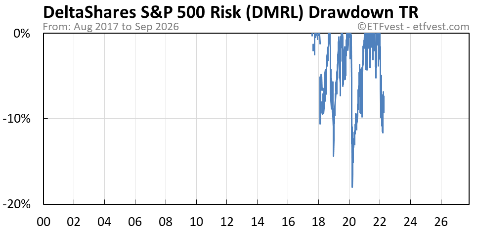
So how much has DeltaShares S&P 500 Managed Risk ETF (DMRL) declined from its peak? When the blue line is at 0%, the ETF is (or was) at its peak. Otherwise, it is (or was) below its peak by the amount indicated on the y-axis. Like all other charts on this page, this chart uses total return data.
The toal return chart below illustrates the performance of DeltaShares S&P 500 Managed Risk ETF (DMRL) (blue line) and S&P 500 (gray line) during the Covid bear market.

The total return chart below illustrates the performance of DeltaShares S&P 500 Managed Risk ETF (DMRL) (blue line) and S&P 500 (gray line) during the financial crisis bear market.

The total return chart below presents the relative strength of DeltaShares S&P 500 Managed Risk ETF (DMRL) as compared to the benchmark S&P 500. When the blue line in the chart is trending up, the ETF is outperforming the S&P 500 and when it is moving down it is underperforming.

The following total return chart illustrates the relative strength of DeltaShares S&P 500 Managed Risk ETF (DMRL) as compared to the popular/tech-laden Nasdaq 100. When the blue line in the chart is moving up, the ETF is outperforming the Nasdaq 100 and when it is trending down — underperforming.

The total return chart below presents the relative strength of DeltaShares S&P 500 Managed Risk ETF (DMRL) as compared to the Russell 2000 (i.e., small-cap stock index). When the blue line in the chart is working its way higher, the ETF is outperforming the Russell 2000 and when it is headed lower it is underperforming.

The following total return chart illustrates the inflation-adjusted performance for DeltaShares S&P 500 Managed Risk ETF (DMRL). The U.S. dollar tends to lose purchasing power over time. The following chart adjusts for the ever shrinking dollar so you can see what real total return gains the ETF is actually providing.

So how is DeltaShares S&P 500 Managed Risk ETF (DMRL) performing when priced in that other world currency — gold? The following gold-adjusted chart answers that question.

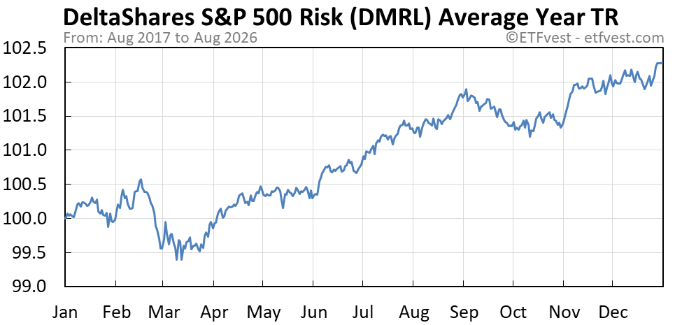
The following total return chart presents the average year performance for DeltaShares S&P 500 Managed Risk ETF (DMRL). There is a season for all things. Well, at least some things.
The total return chart below provides a slightly differnet perspective to seasonality. It illustrates the average year for DeltaShares S&P 500 Managed Risk ETF (DMRL) divided by the S&P 500. When the blue line is trending higher, the ETF has outperformed the S&P 500 on average during that part of the year. When the blue line is moving lower, the ETF has underperformed the S&P 500 — on average.
